Monday, July 20, 2009

Theory of Color

Color theory is a body of practical guidance to color mixing and the visual impacts of specific color combinations in the visual arts. Although color theory principles first appear in the writings of Leone Battista Alberti (c.1435) and the notebooks of Leonardo da Vinci (c.1490), a tradition of "colory theory" begins in the 18th century, initially within a partisan controversy around Isaac Newton's theory of color (Opticks, 1704) and the nature of so-called primary colors. From there it developed as an independent artistic tradition with only superficial reference to colorimetry and vision scien.

Color abstractions
The most important problem has been a confusion between the behavior of light mixtures, called additive color, and the behavior of paint or ink or dye or pigment mixtures, called subtractive color. This problem arises because the absorption of light by material substances follows different rules from the perception of light by the eye.
A second problem has been the failure to describe the very important effects of strong luminance (lightness) contrasts in the appearance of surface colors (such as paints or inks) as opposed to light colors; "colors" such as grays, browns or ochres cannot appear in light mixtures. Thus, a strong lightness contrast between a mid valued yellow paint and a surrounding bright white makes the yellow appear to be green or brown, while a strong brightness contrast between a rainbow and the surrounding sky makes the yellow in a rainbow appear to be a fainter yellow or white. A third problem has been the tendency to describe color effects holistically or categorically, for example as a contrast between "yellow" and "blue" conceived as generic colors, when most color effects are due to contrasts on three relative attributes that define all colors:

1. lightness (light vs. dark, or white vs. black),

2. saturation (intense vs. dull), and

3. hue (e.g., red, yellow, green, blue or purple).

Thus, the visual impact of "yellow" vs. "blue" hues in visual design depends on the relative lightness and intensity of the hues. These confusions are partly historical, and arose in scientific uncertainty about color perception that was not resolved until the late 19th century, when the artistic notions were already entrenched. However they also arise from the attempt to describe the highly contextual and flexible behavior of color perception in terms of abstract color sensations that can be generated equivalently by any visual media. Many historical “color theorists” have assumed that three “pure” primary colors can mix all possible colors, and that any failure of specific paints or inks to match this ideal performance is due to the impurity or imperfection of the colorants. In reality, only imaginary “primary colors” used in colorimetry can "mix" or quantify all visible (perceptually possible) colors; but to do this the colors are defined as lying outside the range of visible colors: they cannot be seen. Any three real “primary” colors of light, paint or ink can mix only a limited range of colors, called a gamut, which is always smaller (contains fewer colors) than the full range of colors humans can perceive.

The RYB primary colors became the foundation of 18th century theories of color vision, as the fundamental sensory qualities that are blended in the perception of all physical colors and equally in the physical mixture of pigments or dyes. These theories were enhanced by 18th-century investigations of a variety of purely psychological color effects, in particular the contrast between "complementary" or opposing hues that are produced by color afterimages and in the contrasting shadows in colored light. These ideas and many personal color observations were summarized in two founding documents in color theory: the Theory of Colours (1810) by the German poet and government minister Johann Wolfgang von Goethe, and The Law of Simultaneous Color Contrast (1839) by the French industrial chemist Michel Eugène Chevreul.

Subsequently, German and English scientists established in the late 19th century that color perception is best described in terms of a different set of primary colors—red, green and blue violet (RGB) -- modeled through the additive mixture of three monochromatic lights. Subsequent research anchored these primary colors in the differing responses to light by three types of color receptors or cones in the retina (trichromacy). On this basis the quantitative description of color mixture or colorimetry developed in the early 20th century, along with a series of increasingly sophisticated models of color space and color perception, such as the opponent process theory.

Across the same period, industrial chemistry radically expanded the color range of lightfast synthetic pigments, allowing for substantially improved saturation in color mixtures of dyes, paints and inks. It also created the dyes and chemical processes necessary for color photography. As a result three-color printing became aesthetically and economically feasible in mass printed media, and the artists' color theory was adapted to primary colors most effective in inks or photographic dyes: cyan, magenta, and yellow (CMY). (In printing, dark colors are supplemented by a black ink, known as the CMYK system; in both printing and photography, white is provided by the color of the paper.) These CMY primary colors were reconciled with the RGB primaries, and subtractive color mixing with additive color mixing, by defining the CMY primaries as substances that absorbed only one of the retinal primary colors: cyan absorbs only red (-R+G+B), magenta only green (+R-G+B), and yellow only blue violet (+R+G-B). It is important to add that the CMYK, or process, color printing is meant as an economical way of producing a wide range of colors for printing, but is deficient in reproducing certain colors, notably orange and slightly deficient in reproducing purples. A wider range of color can be obtained with the addition of other colors to the printing process, such as in Pantone's Hexachrome printing ink system (six colors), among others.

For much of the 19th century artistic color theory either lagged behind scientific understanding or was augmented by science books written for the lay public, in particular Modern Chromatics (1879) by the American physicist Ogden Rood, and early color atlases developed by Albert Munsell (Munsell Book of Color, 1915, see Munsell color system) and Wilhelm Ostwald (Color Atlas, 1919). Major advances were made in the early 20th century by artists teaching or associated with the German Bauhaus, in particular Wassily Kandinsky, Johannes Itten, Faber Birren and Josef Albers, whose writings mix speculation with an empirical or demonstration-based study of color design principles.

Monday, July 13, 2009

Type font

FILE™ free font

Here one of the example fonts that I get from fontfabric.com always produce typefaces with contemporary looks. Introducing the new released typeface by fontfabric.com. This typeface is good for any type of graphic design.


Sunday, July 12, 2009

Type Font

Type font Titillium is a high quality sans serif typeface. It comes with various font-weight in a set. There is also available Titillium extra-black version to download for free.

typeface,typography

Saturday, July 11, 2009

Mac vs. PC

One of the most common ongoing debates in the computer world is "Mac vs. PC." Macs, produced by Apple, have often been used in the design world, with the PC (running the Windows operating system) dominating most of the business world. When looking at the two for graphic design work, the focus is on the handling of graphics, color, and type, the availability of software, and overall ease of use.

Graphics, Color and Type

The handling of graphics, color and type is a significant portion of a graphic designer’s job. Because of Apple’s long history of being the “designer’s computer,” they have focused on improving their handling of colors and fonts, especially when going from screen and file to print. If you had to choose between a Mac and a PC on this factor alone, Apple has the edge. However, the same results can be achieved on a PC. For web design, neither wins out, though be sure to have access to both operating systems to test your sites across all platforms.


Mac vs. PC Software

As far as graphic design is concerned, there is no significant difference in the software available for the Mac or PC. All of the major applications, including the Adobe Creative Suite, are developed for both platforms. Because the Mac is often considered the designer’s computer, there are some handy tools and applications that are Mac-only. Overall, there is more software available for the PC, especially if you are focused on a particular industry, gaming or 3-D renderings (such as for architecture).


Ease of Use

Apple has clearly focused their operating system on ease of use, introducing new features with each release that improve the user experience. Their integration from application to application enables a clean workflow. While this is most apparent in their consumer applications such as iPhoto and iMovie, it continues through to professional tools and third-party products. While Microsoft has improved the user experience in the Windows operating system, I would give the edge to Apple on ease of use.


Mac vs. PC Conclusion

Generally, “Macs” are mentioned in the same sentence as “graphic design,” and rightfully so for their excellent graphics and font capabilities, and ease of use. The drawback of the Apple used to be the price, but if you do want a Mac and are tight on budget consider the “consumer” level iMac, which is powerful enough for graphic design tasks, or a refurbished model. In the end, especially when starting out, you will probably do just as well with a PC. With some smart shopping you can get a powerful one for less money than a Mac, and you will be using the same design software… your creativity, and not the cost of your computer, will determine the outcome of your work.


source : graphicdesign.about.com

Color Psychology of Common Colors

Color is a magical element that gives feeling and emotion to art, design, and advertising. By understanding color meaning, (or the psychology of color) you can choose the right color to support and emphasize your design.

A dominant color or overall color scheme can determine the tone of your document. Certain colors will help your product, corporate document, or advertisement attract specific audiences and evoke desired responses.
The information below provides generally accepted guidelines on the symbolic meanings of color and how you can use color more effectively in your marketing pieces.

The meaning of the color yellow (including coral, orange, amber, gold)
Symbolizes: Energy, caution, warmth, cheer, joy
Yellows are often associated with the following characteristics: homey, friendly, soft, welcoming, moving, excitement, or adventure. Good for press kits, stationery, and shopping bags. Use yellow for signage in work situations warning of danger. Yellow is also good for any project that needs to evoke feelings of lightheartedness, humor, or friendliness.

The meaning of the color red (including mauve, magenta, crimson, scarlet, poster red)
Symbolizes: Power, romance, vitality, earthly, energy
Reds evoke highly charged emotions such as aggression, danger, or love. Red makes us pay attention and catches our eye immediately so use reds on items that need to grab attention. In the financial arena, red symbolizes a negative direction.

The meaning of the color green (including lime, leaf green, sea green, emerald, teal, sage)
Symbolizes: life, foliage, grass, trees, water
Greens are sensuous and alive. Green is associated with the following characteristics: friendliness, dependability, freshness, non-threatening, safe, secure, healthy, strong, expensive, and primitive. In the business world, green symbolizes growth and prosperity.

The meaning of the color blue and purple (including sky blue, ultramarine, violet, purple, azure)
Symbolizes: Peace, law and order, logic, analytical, intelligent, honest, calm, clean, good will, tranquility, compassionate, serious, thoughtful, quiet, reflective, regal, classic, dependable, trustworthiness, tradition, magical
Blues are often used for older, more mature audiences and situations. Blue is common in financial institutions, hospitals, and legal and medical professions. Purples have long been associated with royalty, magic and power Purples are often used with feminine, rather than masculine designs

sumber : macgraphics.net

5 Easy Brochure Design Tips That Work

All of us would like to think our product is so good, our services so unique, they’ll simply sell themselves. Not so! Strong branding, powerful images, compelling web pages and outstanding marketing pieces make or break that upward sales curve you crave so urgently. In today’s market, your customers and clients are influenced more than ever by the visual presentation of your marketing pieces.

For example, a powerful brochure design will more likely to be read, remembered and respected. Here are five simple, but essential tricks of the designer's trade that you can use immediately, at little cost, to improve your brochure design.

1. Take advantage of quality clip art and stock photos
Chances are you’re not an illustrator or photographer, but that shouldn’t stop you from using professional illustrations or photos in your marketing piece. You can use clip art—sometimes at a very low price—to enhance your layout. Check out the Internet for sites that feature clip art or stock photo libraries that provide a wide variety of quality and prices to choose from. Use the same style of graphics throughout your brochure design to create a consistent look.

2. Jazz up your layout so your most important points stand out
Break up monotonous lines of text with attractive “pull quotes” or “call-outs,” which make critical information stand out on the page. To create a pull quote, just copy a provocative or challenging statement from your text and paste it into a different position on the page using large, contrasting type. Add decorative quotation marks, border it with lines, or place it inside a box to jazz it up.

3. Repeat certain elements
Good design calls for repeating certain elements throughout your piece to make the whole piece come together visually. For example, use the same color, shape, and size for all your bullets. Also make all your headers the same size, color, and font. Repeat specific graphic elements such as boxes, banners, and rule lines throughout the piece. A word of caution: When you review your work, make sure you’ve used all of these design elements consistently.

4. Pay attention to proximity
Proximity refers to the exact spatial relationships between elements. For example, you create visual relationships between photos and their captions by keeping the captions close to the photos. For subheads, a pro positions them closer to the text below than the text above. Apply this principle of exact spatial relationship to all other graphic and text elements where appropriate. When you review your work, make sure you’ve applied this spacing consistently throughout.

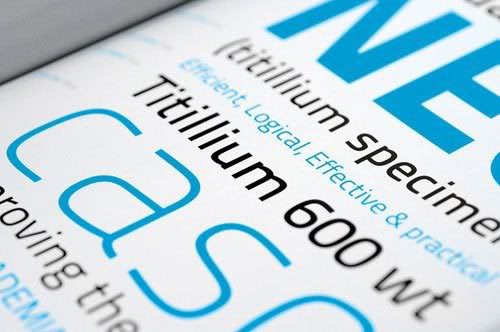
5. Know when to use serif and sans serif fonts
In general, when you have a large amount of text, it is best to use a serif font because it is easier to read than a sans serif font. Serifs are the tiny horizontal strokes attached to the letters which help the reader’s eyes flow from letter to letter. Bold sans serif (without serifs) are good for headlines and subheads because they slow the reader down thus bringing more attention to each word or concept. Some examples of serif fonts that are good for body copy are: Times, New Century Schoolbook, Garamond and Goudy. Some examples of sans serif fonts that are good for headlines are: Arial Bold, Helvetica Black, Univers Bold and Trade Gothic.

sumber : macgraphics.net

Wednesday, July 8, 2009

Definition of Graphic Design

Graphic design is a form of visual communication using images to convey information or messages as effectively as possible. In graphic design, text, images are also considered as an abstraction of symbols that can be sounded. Graphic design is applied in communication design and fine art. Like other types of design, graphic design can refer to the process of manufacturing, design methods, the product (design), or any discipline that is used (design). Graphic design art include cognitive abilities and visual skills, including typography, illustration, photography, image processing, and layout.

Graphic design was originally applied to static media, such as books, magazines, and brochures. In addition, in line with the times, graphic design is also applied in the electronic media, which are often referred to as interactive design or multimedia design. One-dimensional boundary has changed over the development of thinking about design. Graphic design can be applied to a design environment that includes the processing space.

Elements in graphic design as basic elements in other design disciplines. These elements (including shape, shape (form), texture, line, space, and color) form the basic principles of visual design. These principles, such as the balance (balance), rhythm (rhythm), stress (emphasis), the proportion ( "proportion") and unity (unity), then form a structural aspect of a larger composition.

source: wikipedia

Tuesday, July 7, 2009

History of Typography

Typography is a science in selecting and arranging the letters with their distribution arrangements in the spaces available, to create a certain impression, which can help the reader to get the maximum reading comfort. Typography art is also known, namely the work or design that uses the letters settings as the main element. In the art of typography, understanding the letter as a symbol of the sound can be ignored.

Historical development starting from the use of typography pictograph. This form of language, among others used by the Norwegian Vikings and Sioux Indian. Developed in Egypt Hieratia typeface, known as the hieroglyphs in 1300 about the seventh century BC. Typographic forms is at the root of Demotia forms, which were written using a special pen. Typographic forms is finally growing up in Crete, and then spread to Greece and eventually spread throughout Europe. Peak development of typography, occurred about 8 century BC in Rome as the Romans began to establish his authority. Because the Romans did not have their own writing system, they learn the Etruscan writing system which is a native of Italy and perfected in order to establish Roman letters. We have developed typefaces from the phase of creation with his hands up to having computerized. Phase computerization makes use of typography becomes easier and in a faster time with a choice of hundreds of letters.

Mostly the letters are classified into:

Roman, with the characteristics of a fin / foot / pointy shaped serifs on the ends. The impression created is classic, elegant, graceful and feminine.

Egyptian, with the characteristics of the foot / fin / square serifs like a board with a thickness equal or nearly equal. The impression created is sturdy, strong, sturdy and stable.

Sans Serif, with the features without fins / serif, and has a thickness the same letter or almost the same. The impression created by the letter of this type is a modern, contemporary and efficient.

Script, is a scratch done hand with pen, brush or pencil sharp and usually skewed to the right. The resulting impression is a personal and intimate sifast.

Miscellaneous, is the development of the forms that already exist. Plus decorations and ornaments, or decorative lines. Owned impression is decorative and ornamental.


Legibility is the ease of recognizing the eyes can be made without working too hard. This can be determined by:

1. Character design complexity, such as the use of serifs, the contrast of stroke, etc..

2. Use color

3. Frequency of observers to see the letter dlm daily life

Readability is the comfort level of a structure when reading the letter, which is influenced by:

1. Typeface

2. Size

3. Settings, including flow, spacing, kerning, alignment, etc..

4. Color contrast against the background


source: wikipedia

Monday, July 6, 2009

Color management system

There is no device in a publishing system that can translate a variety of colors are viewed accurately with the human eye. Each device operates in a particular color space that can produce a range, or overall color.

Color model to determine the relationship between values and the absolute color space defines the meaning of those values as colors. Some color models (such as the CIE L * a * b) still has a color space, their space was directly related to how humans see color. This model will be explained as a standalone device. Other color models (RGB, HSL, HSB, CMYK, etc.) can have different color spaces. Because the model is different from the color of each space-related or device, they are depicted as color depends on the device.

As a result of differences in color space, there was a shift in the view your documents on different devices. Color variations can result from differences in the source image; how to set the color of software applications, print media (any type of paper affect the type of print), and other variations.

What is the color management system?
Problem color matching with the results of the various software and use the color space. One solution is to have a system that interprets and translates color accurately between devices. Color management system (Color Management System / CMS) with the color space has been created with the same color space where color will be printed, and make the necessary adjustments to represent the colors to be consistent on different devices.

Color management system translates colors with the color profile support. Color profile is a mathematical description of the device color space. For example, scanner profile tells the color of your management system scanner to "see" color. Adobe color management using ICC Profile, the format specified by the International Color Consortium (ICC) as a cross-platform standards.

Since no single color translation method is ideal for all types of images, color management system provides a choice of rendering intents, translation or method, so you can apply the appropriate method for a particular graphic element. For example, the color translation method that preserves the right in the relationship between color photos of wildlife that can change the color.

Note: Do not confuse color management with color correction. Color management system will not properly stored images with tonal or color balance problems. This provides an environment where you can evaluate images reliably in the context of your final results.

Do you need color management?
Without color management system, could be your color specifications are dependent on the device. You may not need color management if the production process is tightly controlled for one medium only. For example, you or your print service provider can customize the image CMYK color and determine the value to be known, in this particular set of printing conditions.

Color management value increases when you have more variables in the production process. Color management is recommended if you anticipate re-using color graphics for print and online media, using various types of devices in a single medium (such as printing), or if you manage multiple workstations.

You will benefit from a color management system if you need to complete one of the following: Get a predictable and consistent color output in several output devices including color separations, desktop printers, and your monitor. Color management is very useful to adjust the color with a relatively limited devices overall, such as four-color printing process.

Perform Proof Color (first) a document on your monitor's color by doing it simulates a particular output device.

Evaluate accurately and consistently to incorporate color graphics from different sources if they also use management. Send documents to a variety of colors and media devices without having to manually adjust the colors in the original document or graphic. This is especially useful when creating an image that will ultimately be used both in print and online. Print color correctly to the color of an unknown device, for example, you can store documents online to be duplicated consistently color-demand anywhere in the world.

Source: Adobe Photoshop CS3 Tutorial

Monday, June 15, 2009

Introduction to Software Design Graphic Print Process

Design is a series of good ideas shedding process is described either manually or processing images / layout with the help of computers until ready for processing in this case ready for print.

In this case (computerized) is known by the term 2 Picture element (called Pixel) and Vector (line) both support each other. Difference between the two is that Pixel will depend on the name resolution while the vector did not. This means that if the image that have the Pixel low resolution if raised will be seen broken while growing up any vector will not break and if we print will be very clear difference between the two.

In the world of Design (print) known to a lot of software that supports the processing of images and layouts.

A. Layout processing software (layout)

1. Adobe Page Maker
2. Adobe in Design
3. Adobe Frame Maker
4. Corel Ventura
5. Microsoft Publisher
6. Quark Express

This software is usually for the need to make magazine pages, books, newspapers etc. in a very flexible because it can regulate the placement of text and images.

B. Vector Image Processing Software

1. Adobe Illustrator
2. Macromedia Freehand (there is no new version since been acquired by adobe)
3. Corel Draw
4. Etc.

The software used for the purposes of making logos, calendars, brochures, etc.. Actually (for CorelDRAW) was also able to arrange the layout of newspaper pages in magazines, books, etc., depending on ourselves.

C. Pixel Image Processing Software

1. Adobe Photoshop
2. Corel PhotoPaint
3. Macromedia Xres
4. Etc.

This software is usually for editing photos, either for retouching or image manipulation

Wednesday, April 15, 2009

Typografi

Johannes Gensfleisch zur Laden zum Gutenberg (c. 1398 - February 3, 1468) is an intelligent metal and the German creator of the getting fame thanks to its contribution to the printing technology in the year of 1450, including letters of metal alloy (type metal) and oil-based ink, print to print the letter correctly, and a new kind of printing on printers that are used in making wine. As with the creator of the tradition called movable type in Europe, an improved system of block printing already in use in the region. By combining these elements in a production system, it enables the printing of written material quickly, and the explosion of information on the European Renaissance. Gutenberg came from an aristocratic family and received early training as a goldsmith. In the year 1428, due to politics, he moved to Strasbourg and stayed there for 20 years Palatino font type is created by Hermann Zapf in 1948. Source of inspiration is the writings of the Renaissance era. Palatino is the result of the use of inverted pen broadnip a calligraphic impression. But the difference with writing renaissance is the calligraphic strokes that are used a little more weight to more easily read. In bitstream font collections, this font is known as Zapf Calligraphic. Fonts are then licensed by Linotype and Adobe Systems by the name of Linotype Palatino. This typeface used is very popular in the world of modern typography.

source: wikipedia

Principles and design elements

Elements in graphic design as a basic element in the design of other disciplines. These elements (including shape, shape (form), texture, line, space, and color) form the basic principles of visual design. These principles, such as the balance (balance), rhythm (rhythm), pressure (emphasis), the proportion ( "proportion") and unity (unity), and form aspects of the structural composition of the more knowledgeable.

Graphic design is a form of visual communication using text and image or to convey information or messages. Graphic art design includes the ability and cognitive skills, including typography, image processing, and page layout. Graphic Designer up view the composition of letters and spaces to create a design that is effective and communicative. Graphic design covers all areas of the require verbal language translation into the visual design of text and images in various media publications in order toconvey messages to the komunikan as effective as possible. Graphic design is applied in communication design and fine art. Like other types of communication, graphic design can refer to the process of (design) or products produced (design / design). Graphic design was initially applied to static media, such as books, magazines, and brochures. In addition, in line with the development of the age, graphic design is also applied in the electronic media - often referred to as the as "interactive design" (interactive design), or "multimedia design" (multimedia design ')

From Wikipedia, the free encyclopedia.


Equipment graphic design (History) Equipment used by the graphic designer is preposterous, eye, hand, traditional tools (such as a pencil or ink), and the computer. A concept or idea is usually not considered as a design before realized or expressed in visual form. However, the most important tool, and most needed in the design is understanding. The critical mind, observasional, kuantitif, analytical and also needed to design and realize these ideas. The critical mind, observasional, quantitative and analytical also needed to design a mengkomposisi. When the pendesain only the sketch, script or instructions (which may be provided by the creative director) and can not referred to as a designer. Eyes and hands are often assisted with the use of traditional instruments or digital image editing features. Elections way the idea that right is also a key skill in graphic design work, and is a key factor in visual manifestation. In mid 1980, the coming introduction of desktop publishing and a number of graphic software applications introduced one generation of designers on a computer with image manipulation and 3D image creation that was the work of laborious. Graphic design with a computer allows the designer (designer) to see the effects of changes in layout or typography with immediately without using ink or pen, or to simulate the effects of traditional media without the need to demand more space. In general, the computer is seen as a very necessary tool in the graphic design industry. Computer and software applications generally seen, by creative professionals, as a means of producing a more effective compared with traditional methods. However, some designers continue to use a graphical tool in the traditional and manual work, such as Milton Glaser There is debate about whether computers enhance the creative process of graphic design. The rapid production of the computer allows the graphic designer to explore ideas more quickly and more detail than can be achieved with the touch of hands or cut-paste on the paper. However, faced the choice of the infinite is sometimes not such produce design solutions the best and sometimes only make a spin without a clear idea of the new-ideas often come with the pilot on the tools and methods, both the traditional and digital media. Some professional graphic designers explore ideas using pencil on paper to avoid the limitations of computer, allow them to think outside the box. Some of the ideas of creative graphic design and development begins even approaching the end result in mind, before the method is applied both traditional and computer. There is also a the establishment of the visualization that the use of computers with the capability of making a complex picture and quickly. A graphic designer can also use sketches to explore ideas that quickly without complex concentration broken problems because of technical computer software. "Comp" (in terms of graphic design refers to the initial design for the proposed on the client, shortness of comprehensive layout), handmade often used to obtain approval from a graphic design ideas. Thumbnail sketches in the form of graffiti or graffiti-rough draft on paper can also be used to generate ideas in a process hybrid (combination of the use of computers and scratches). Hybrid process such as this particularly useful in creating a logo design where the technical problems of software often solve concentration. Hybrid process also is used to free creativity someone in creating a page layout or image development. A graphic designer can also employ traditional artists production (production artist) who skillfully use the computer to realize the idea of a sketch he makes.